Designing for Online Sales
A concept redesign of the Van Gogh Museum homepage, built around what visitors actually came to do.
- Client
- Van Gogh Museum (concept)
- My role
- UX structure, UI design, Conversion rationale
Context
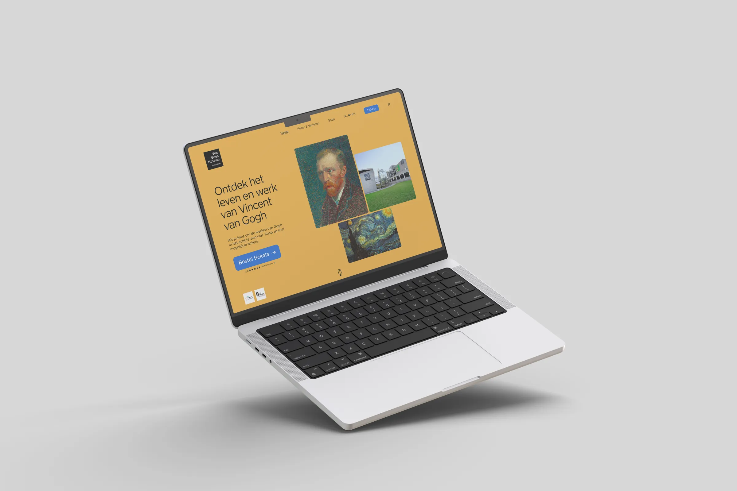
A conceptual redesign of the Van Gogh Museum website, exploring how UI and UX decisions can support commercial goals while respecting the museum’s cultural identity. The focus was clarity, navigation and flow, not new features.
The challenge
The site does a lot: it informs visitors, sells tickets and sells merchandise. Those competing priorities crowd the homepage and make it harder to know where to go. The new structure had to support conversions without feeling commercial or pulling attention from the art.
Structuring user pathways
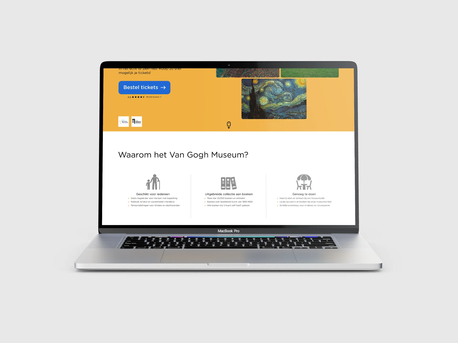
I rebuilt the homepage around three main intents: buying tickets, exploring artworks and discovering shop products. Each gets a clear, early entry point with consistent visual treatment.
Content blocks were reorganised to cut noise and guide attention, so key actions stay prominent and supporting content adds context instead of competing.
Hierarchy and refinement
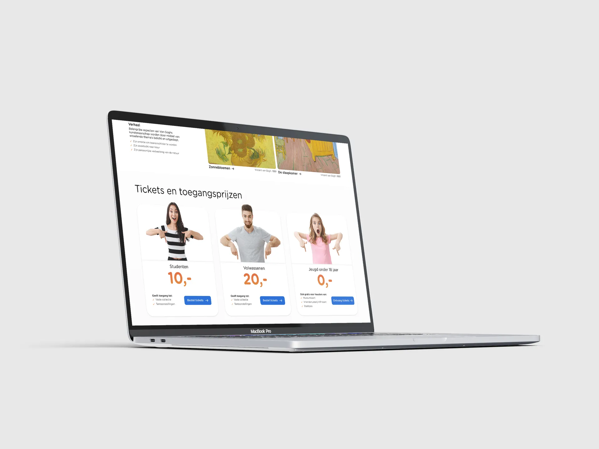
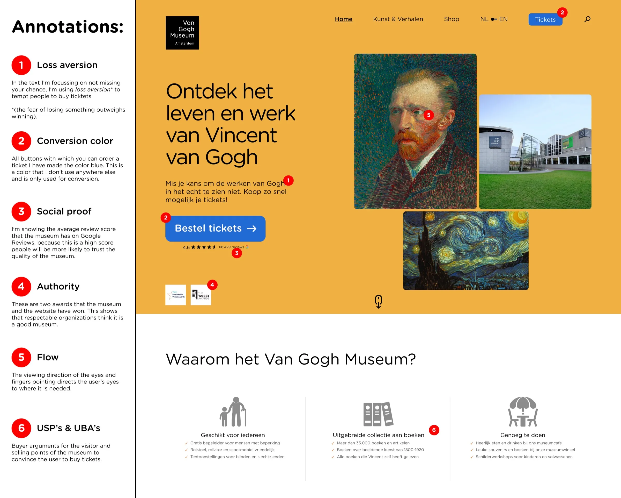
Visual hierarchy did most of the work. I refined spacing, typography, contrast and component sizes for a clearer reading order and more predictable navigation. Every change came with a conversion-focused rationale explaining how it reduces friction in the decision.
Outcome
A cleaner, more structured homepage that supports ticket sales and shop discovery through clarity rather than persuasion. It shows how small, intentional UI decisions can improve flow and sales potential without compromising the brand or its content.