Designing with Typography
A type specimen booklet staged like a silent film, letting a typeface show its mood instead of just its letters.
- Client
- Personal project
- My role
- Concept, Editorial design, Image making
Context
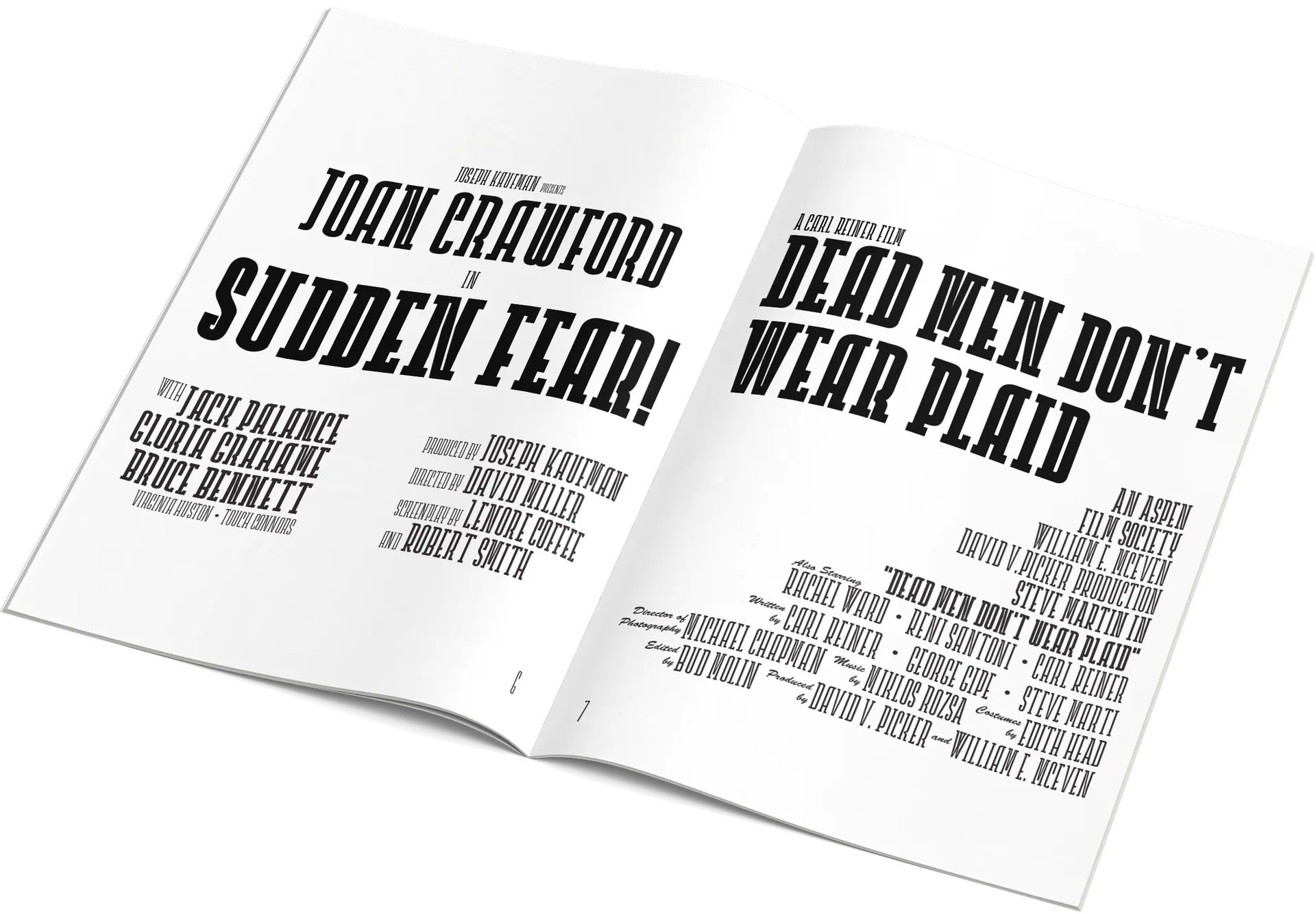
A type specimen booklet exploring how typography can be presented through editorial design. Instead of only showing letterforms, it tries to capture the character and atmosphere of a single typeface.
Choosing the typeface and theme
The typeface reminded me of early 20th-century cinema, old movie posters and film noir. Its shapes, contrast and proportions felt tied to that era, which became the concept: the booklet is approached like a silent film, where type, images and pacing set a mood rather than explain it.
Layout and rhythm
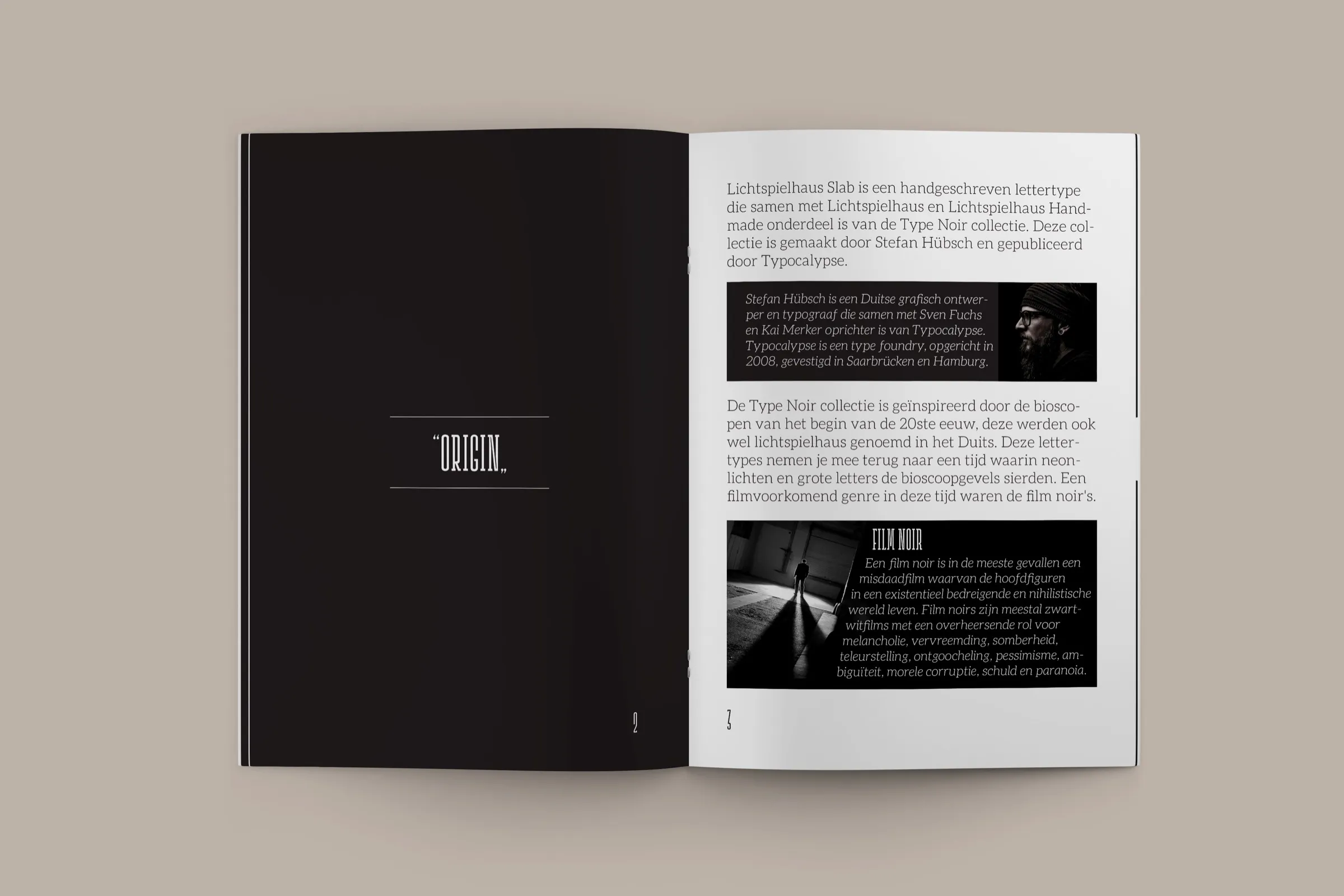
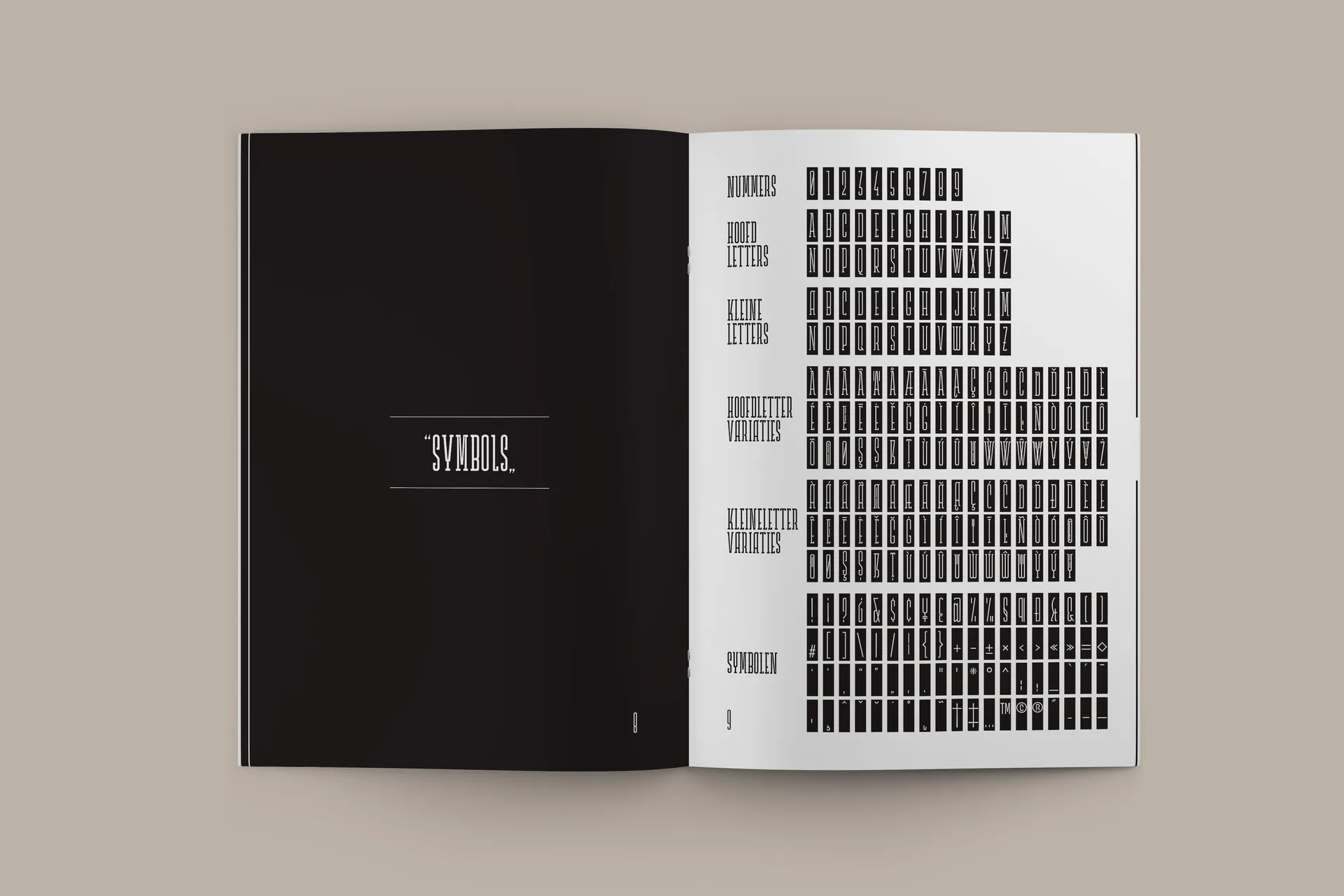
The layout gives the typeface room to speak. Expressive spreads alternate with more systematic pages showing weights, characters and symbols. Some spreads are dense and dramatic, others quiet and minimal, echoing a silent film where tension and stillness take turns.
Visual exploration
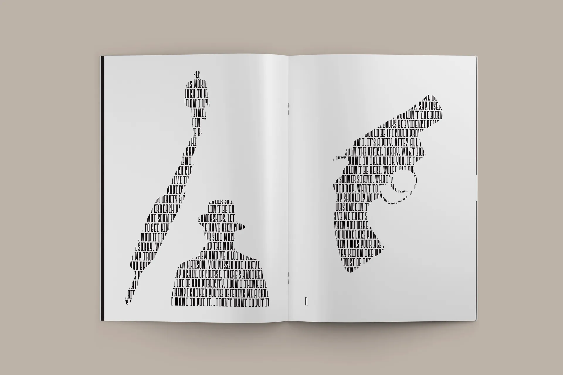
I made images and compositions out of the letterforms themselves, treating letters as shapes and silhouettes that reference classic cinema. Texture and photography were used sparingly to keep the focus on the type.
Outcome
A cohesive specimen that captures the typeface through mood, imagery and structure. It’s less about explaining a font and more about interpreting it: showing how type can suggest an era and an atmosphere in the right context.